Our Logo & Brand Story
At Hsun Wang, our logo is more than just a visual symbol; it embodies our core values and commitment to our partners.
-
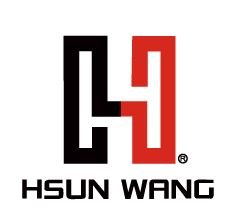
Black Segment: Represents professionalism and stability, reflecting our expertise and the trust we've built with our clients.
-
Red Segment: Symbolizes passion and vitality, highlighting our respect and dedication to customer relationships.
Together, these colors form the letter "H," resembling two hands joined in partnership, symbolizing collaboration and mutual trust. This design conveys our philosophy: "Working hand in hand for mutual success."
This page can also include visuals of the logos: the main Hsun Wang logo, the LiCrim brand logo, and the domestic electronics division logo, each accompanied by a brief description of their significance.
By creating this dedicated subpage, visitors can gain a deeper understanding of our brand identity and values, enhancing their connection with our company.

About Hsun Wang
Our Logo. Our Vision.
At Hsun Wang, our corporate logo tells a story of professionalism, collaboration, and trust.
The bold black symbolizes stability and expertise—foundations of the long-standing confidence our clients place in us. The red reflects passion and energy—our commitment to understanding and supporting every customer. Together, the dual tones resemble two hands joined in partnership, forming the letter "H" to represent harmony, mutual respect, and shared success.
It’s a visual pledge to walk side-by-side with our partners toward a stronger, brighter future.

LiCrim: Power in Precision
LiCrim is the premium crimping tool brand developed by Hsun Wang.
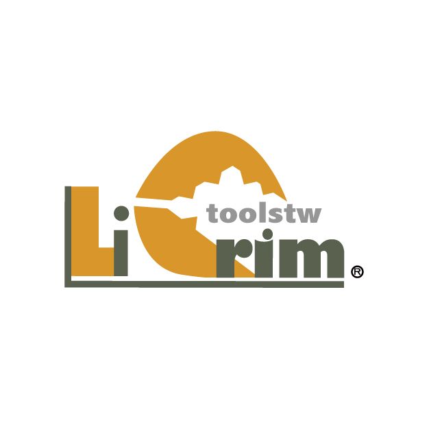
The name “LiCrim” combines “Li”—phonetically meaning “power” in Chinese—with “Crim”, short for “crimp.” It represents strength in every crimping application.
Our logo design features a claw-shaped “C”, inspired by a powerful pincer, symbolizing our tools’ ability to firmly grip, cut, and secure connections with confidence and accuracy. LiCrim tools are engineered to empower professionals across automotive and industrial sectors with unmatched efficiency and reliability.
 HW: Powering Domestic Electronics
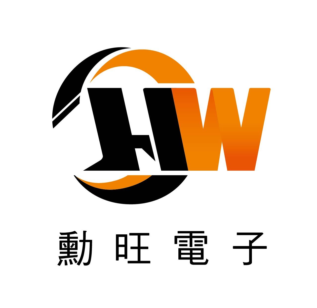
The HW logo is used for our Taiwan domestic electronic product division.
Orange signifies high-voltage energy and innovation, while black reflects our dedication to top-tier quality.
This mark embodies our local commitment to delivering trusted performance in electronic components and connectivity solutions.